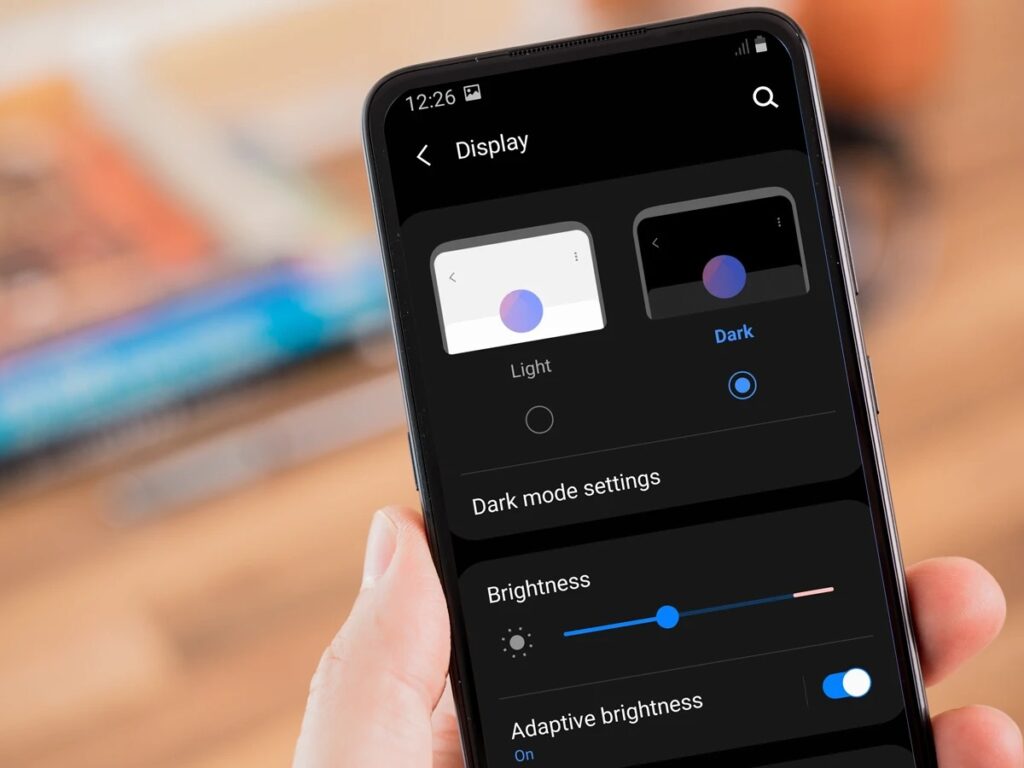
Embracing dark mode, once reserved for night owls and hackers, has transcended niche preferences, emerging as a mainstream phenomenon. From sleek mobile interfaces to cinematic streaming platforms, the midnight aesthetic is captivating users and designers alike. Beyond its visual appeal, dark mode presents a captivating case study in user-centric design, technological evolution, and the future of digital interactions.
From Necessity to Desire: A User-Driven Trend
In the quest for practical solutions, dark mode emerged as a remedy to reduce eye strain in low-light settings. Originally rooted in the necessity for visual comfort, it has since traversed a trajectory beyond mere utility. Studies indicate potential benefits for OLED screen battery life, yet its widespread appeal goes beyond technical advantages.
However, the allure of dark mode extends far beyond its functional origins. Beyond the potential battery-saving perks on OLED screens highlighted in studies, its adoption has become emblematic of a generation seeking personalized digital experiences.

Dark mode has transformed into a symbol of sophistication, signifying exclusivity, and fostering a sense of immersion that resonates with modern users.
Designing for the Shadows: Balancing Contrast and Accessibility
For designers, venturing into the realm of dark mode presents a canvas filled with both opportunities and challenges. The transition from light backgrounds to darker hues necessitates a meticulous reconsideration of color palettes, typography choices, and hierarchical structures. In this transformation, achieving and maintaining high contrast becomes a pivotal element, ensuring that legibility remains a cornerstone of the user experience.
However, as designers delve into the allure of darker aesthetics, the spotlight on accessibility intensifies. The shift to dark mode brings forth a set of paramount concerns, especially for users with visual impairments. It demands a delicate equilibrium, where the captivating allure of shadows and contrast harmonizes with the imperative of making digital content accessible to all.
Platform Puzzles: A Patchwork of Implementation
The landscape of dark mode adoption unfolds as a varied tapestry across different platforms. Tech behemoths such as Apple and Google have wholeheartedly embraced it, integrating dark mode as a default option seamlessly. In contrast, platforms like Windows present it as a selectable choice, introducing a diverse array of implementation approaches.
This patchwork scenario offers both challenges and opportunities for designers, compelling them to craft interfaces that are not only adaptable but also ensure consistency across a spectrum of user experiences.
Navigating this nuanced terrain becomes an art, where the design seamlessly aligns with the platform while preserving a unified and coherent visual language.
Designers must strike a delicate balance, embracing the flexibility inherent in varied implementations to create interfaces that feel intuitive and cohesive regardless of the underlying platform’s approach.
Beyond the Black Canvas: The Future of Dark Mode
Dark mode extends beyond a mere color scheme; it represents a paradigm shift driven by user demands for personalized and immersive experiences. As we look ahead, the future holds the promise of adaptive dark modes that intelligently adjust to ambient lighting and individual preferences.
Envisioning this future, interfaces seamlessly transition between light and dark, offering a dynamic and tailored experience that aligns with the user’s context and enhances the overall digital interaction.
This evolution transcends the static dichotomy of dark and light, ushering in an era where the user’s preferences and environmental conditions converge to shape interfaces that are not just visually appealing but also intuitively responsive to the nuances of the user’s digital journey.
A Canvas for Creativity: Dark Mode as Design Catalyst
Dark mode emerges as a compelling canvas, challenging designers to reconsider traditional principles and venture into uncharted territories of communication. The delicate equilibrium between aesthetics, usability, and accessibility becomes paramount in this design evolution.
Mastering the interplay of light and shadow within dark mode, designers unlock the potential to craft user-centric interfaces that transcend mere visual appeal. It’s a journey where the pursuit of beauty harmonizes with the quest for deep meaning, providing users with an immersive and thoughtfully designed digital experience.
So, is dark mode just a fleeting fad, or is it here to stay? The answer lies in its adaptability and evolution alongside user needs and technological advancements. As long as it continues to offer practical benefits, emotional resonance, and a platform for creative expression, dark mode is poised to remain a dominant force in the future of UI/UX design.

