Dribbble, the design-centric platform, stands as a virtual showcase for creativity and visual ingenuity. Designers flock to Dribbble to display their best work, creating a captivating tapestry of aesthetic brilliance.
The platform, however, unveils a paradox—while the designs showcased are undeniably astonishing, the allure of glamour often overshadows crucial considerations of practicality, user experience, and becomes a potential nightmare for developers tasked with bringing these visions to life.
The Glamour of Dribbble Designs:
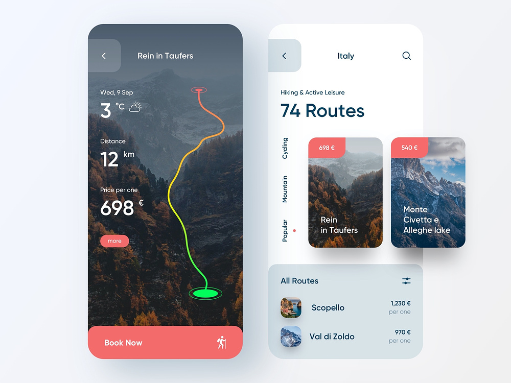
Dribbble has become synonymous with eye-catching designs that push the boundaries of creativity. The platform celebrates aesthetics, encouraging designers to showcase their most visually striking pieces.
As users scroll through Dribbble, they’re greeted with a feast for the eyes—bold colors, intricate details, and innovative layouts.
The emphasis on glamour, however, raises questions about the balance between aesthetics and the practical considerations necessary for a seamless user experience.
Practicality vs. User Experience:
While Dribbble serves as a haven for dazzling designs, a closer look reveals a potential discord between visual appeal and practical usability.
Some designs, while visually stunning, may sacrifice user experience for the sake of aesthetics. Elements that may appear impressive in static form on Dribbble might prove impractical when implemented in dynamic, interactive interfaces.
The challenge lies in finding a middle ground where design not only captivates the eye but also enhances the overall user experience.
Nightmare for Developers:
For developers tasked with bringing Dribbble designs to life, the glamour showcased on the platform can transform into a daunting challenge.
The dreamy visuals often lack the practical specifications needed for seamless implementation.
What appears as a work of art in a static image may present a nightmare for developers striving to make it functional.
Impractical design choices, vague instructions, and unforeseen complications can turn the development process into a maze, requiring extensive time and effort to navigate.
Impact on Collaboration:
The gap between Dribbble’s design allure and practical implementation doesn’t only affect developers; it also influences collaboration between design and development teams.
Effective communication is paramount in turning a vision into a functional reality. However, the divergence in focus on Dribbble can strain this collaboration.
Bridging this gap requires designers and developers to appreciate each other’s perspectives, fostering a symbiotic relationship that ensures both visual appeal and functionality are seamlessly integrated into the final product.
Finding a Balance:
In navigating the Dribbble dilemma, the key lies in finding a balance between the glamour of design and the practicalities of implementation.
Designers can contribute to a smoother process by providing detailed specifications, considering usability in their creations, and fostering open communication with developers.
Similarly, developers can engage in early discussions, seek clarification when needed, and collaborate proactively to ensure the translation of design into functionality is a collaborative, rather than conflicting, endeavor.
Emphasizing mutual understanding and cooperation can pave the way for designs that not only captivate but also deliver a seamless user experience.
Exploring Alternative Approaches:
As designers navigate the challenges posed by Dribbble’s glamour-focused landscape, considering alternative platforms becomes essential.
Behance, a platform owned by Adobe, offers a holistic view of projects, often featuring case studies that delve into the design process.
Awwwards, known for recognizing excellence in web design, not only celebrates aesthetics but also emphasizes functionality and user experience through its evaluation criteria.
Designers can also embrace collaborative tools like Figma, providing a dynamic space for both designers and developers to work together in real-time.
These platforms facilitate the creation of interactive prototypes, ensuring a more accurate representation of how designs will function in the final product.
Furthermore, the adoption of design systems, such as Material Design or Bootstrap, offers a structured approach to design that promotes consistency and usability.
These systems streamline the design-to-development transition by providing reusable components and clear guidelines, reducing the likelihood of impractical or ambiguous design elements.
By incorporating these alternatives into their workflow, designers can showcase their creativity while acknowledging the practicalities of implementation, fostering a more harmonious balance between design glamour and user-centered functionality.
This shift not only benefits the collaborative process but also contributes to the creation of digital experiences that resonate more effectively with end-users.
The Dribbble dilemma encapsulates the paradox of design glamour—a captivating world of visual wonders that, at times, seems at odds with practical implementation.
As the design landscape continues to evolve, it becomes imperative to acknowledge the challenges posed by the allure of Dribbble’s aesthetic showcase.


